Back-to-School Color Palette Inspired by School Supplies
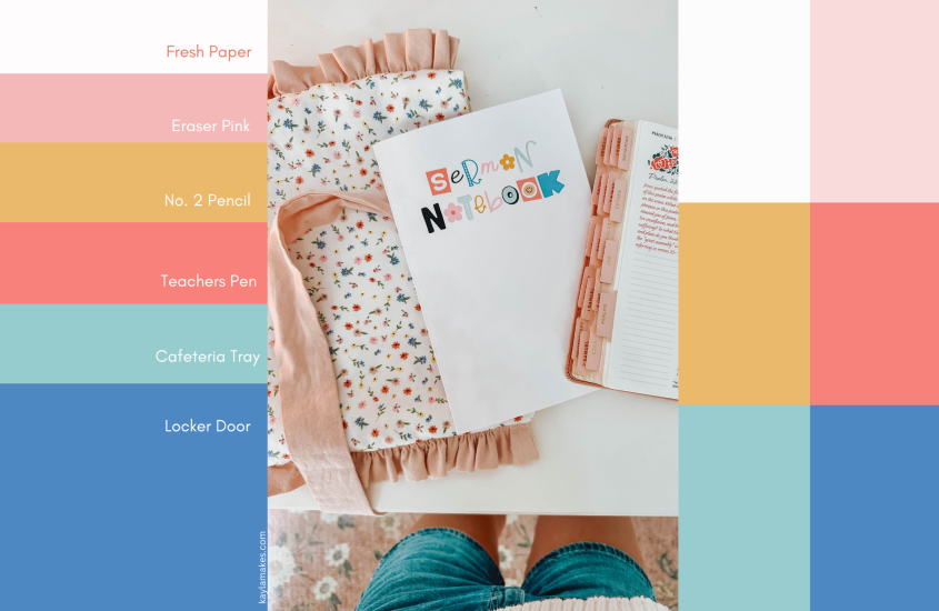
Whether you’re decorating your planner, designing classroom decor, or just looking for a little nostalgic inspiration, this back-to-school color palette brings all the cozy classroom vibes! I took inspiration from everyday school supplies; think pencils, paper, erasers, and binders, and turned them into a color story that’s both playful and practical.
Back-To-School Color Palette
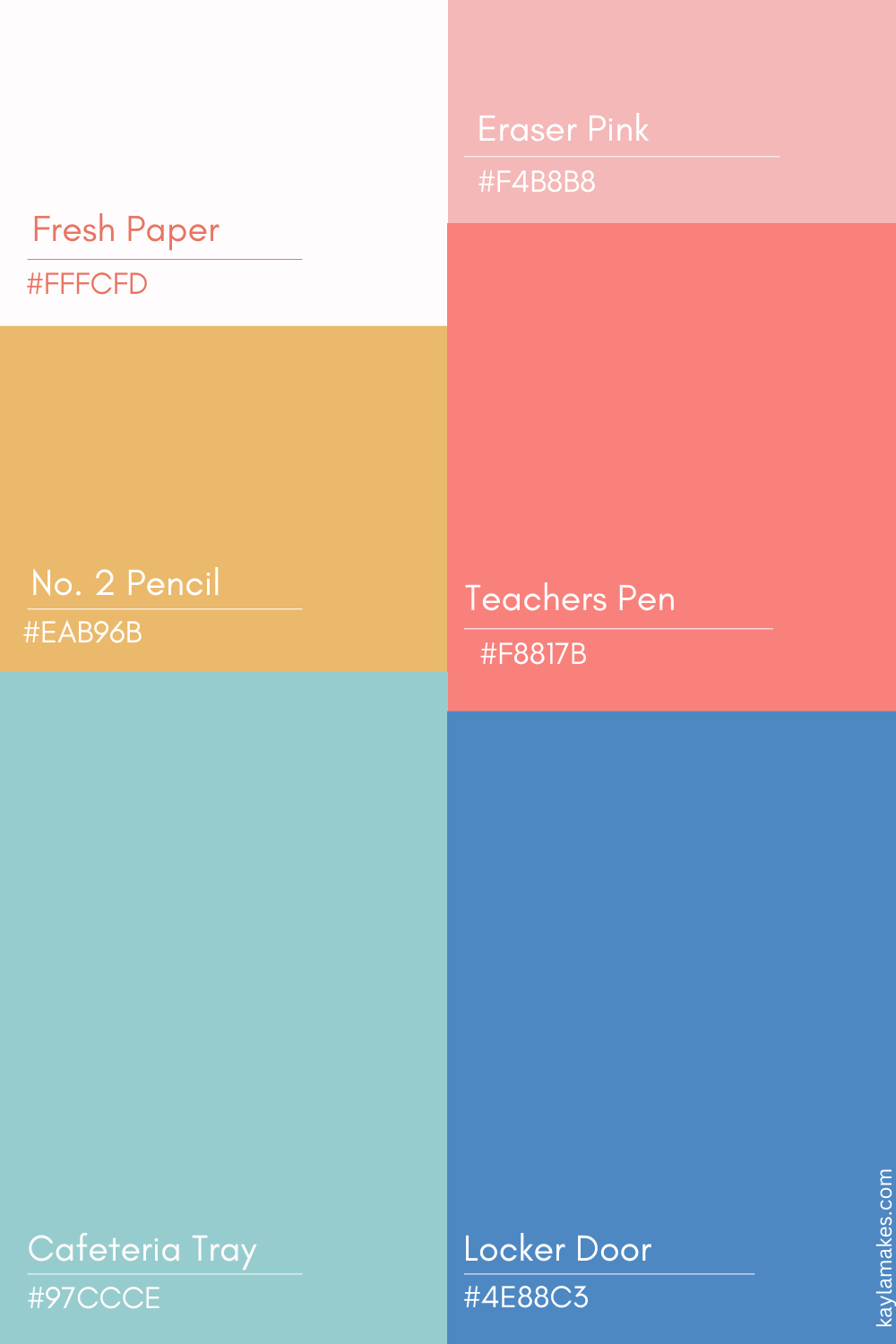
Let’s break it down:
- 🗒️ Fresh Paper (#FFFCFD): Clean, bright, and full of possibilities, just like the first page of your new notebook.
-
💕 Eraser Pink (#F4B8B8): Soft and sweet, this shade reminds me of the classic pink erasers we all had tucked into our pencil pouches.
-
✏️ No. 2 Pencil (#EAB96B): A warm golden yellow that instantly brings to mind sharpened pencils and standardized tests (but in a good way).
-
🖊️ Teacher’s Pen (#F8817B): A bold coral red, perfect for grading papers or making your designs pop, just like a red teacher pen.
-
🥣 Cafeteria Tray (#97CCCE): Soft, calming, and fresh, this one feels like the color of lined paper or a favorite composition book.
-
📚 Locker Blue (#4E88C3): Strong, structured, and dependable, this cool-toned blue reminds me of the plastic binders that kept our chaos organized.
These colors work beautifully together for digital designs, printable back-to-school labels, planner stickers, or even a classroom bulletin board refresh. If you’re a fellow designer or teacher looking for color inspiration, feel free to pin this palette for later!
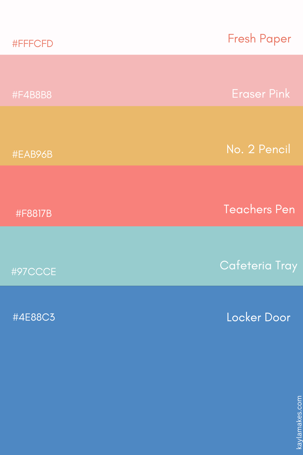
✏️ Want to Use This Palette?
You can grab the hex codes straight from the image above or save it to your Design Inspiration board on Pinterest. If you use it in a project, tag me @kayla_made, I’d love to see how you bring these back-to-school color palette shades to life!
For more color palette inspiration check out this post and this one. If you’re looking for a sermon notebook or bible study journal I would love for you to check mine out here.
